


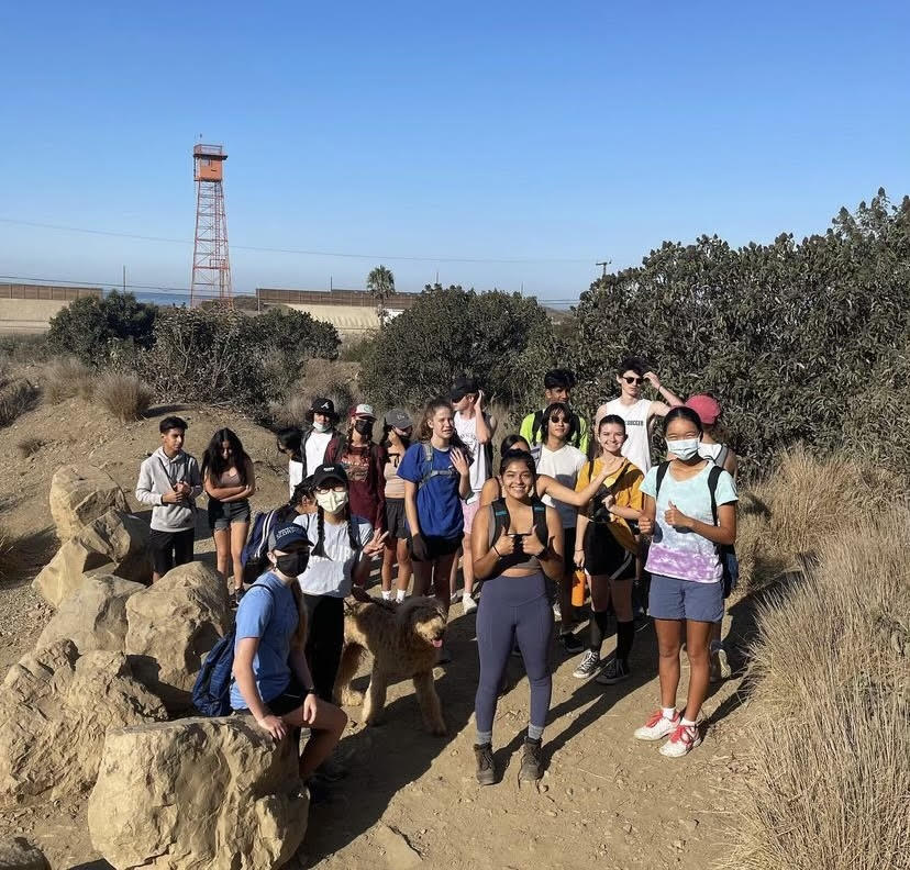


![Senior Ditch Day... Relaxation or Truancy? [Video]](https://achsstinger.com/wp-content/uploads/2017/10/IMG_7119-900x599.jpg)
![Heavy Rain Hits Cam High [video]](https://achsstinger.com/wp-content/uploads/2017/02/maxresdefault-900x506.jpg)


Stinger Rewind: Spotify Wrapped
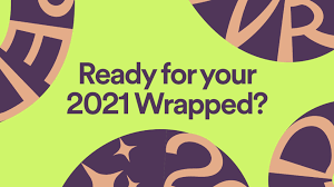
The opening image to Spotify Wrapped 2021.
What has practically become a “holiday” in all but name for many is the annual release of Spotify Wrapped, a long-standing tradition of the Spotify company. Spotify Wrapped provides listeners with insight on their most played artists, songs, podcasts, and more using data collected from the beginning of the year until early December. However, many users immediately expressed their disdain for this year’s Spotify Wrapped. Many users commented on the obviously lazy design of the entire wrapped, including misaligned scrolling decal textures and scrunched up and illegible text. Others were disappointed with its general inaccuracies, including the Wrapped displaying “top artists” that they had never listened to.
Regarding why they started using Spotify in the first place, Cam High Junior Olive Lee stated, “I had nowhere else to listen to music. I bought Spotify a couple of years ago because it was the only place to listen to free music.” They were looking forward to this year’s Spotify Wrapped so that they could reflect on the songs, artists, and playlists they had listened to throughout the year, but were incredibly disappointed. “It was pretty bad. My audio aura was “chill and hopeless romantic”. [I don’t think this is my “audio-aura” and I think it’s inaccurate],” stated Cam High Junior Alyssa Yoon. “It had a lot of unnecessary stuff too. I wanted to see my top songs and artists, but the opening soundtrack to your “life as a movie” [was completed unnecessary]. I feel like my past Spotify Wraps were more accurate, less ugly, and more to the point,” said Lee.
Many users on social media, quickly reached a general consensus that the graphic design on Spotify Wrapped appeared to be “rushed and lazy.” A popular creator on TikTok, emilyzugay, known for her hideous logo redesigns, even participated by scrunching up the text even more in her redesign.“It’s so ugly,” said Lee. “There was one slide that was very ugly and it was the top genres one. Why did they feel the need to cramp all those letters like that?” While showing an image on her phone of the infamous Spotify Wrapped bars, Yoon stated, “Like, what is this; you could do better on Canva. [I think Spotify could have hired better graphic designers.] They could’ve hired a teenage girl.”
Many are hopeful that next year’s Spotify Wrapped will be more aesthetically pleasing and functional. “I feel like my past Spotify Wraps were more accurate and less ugly and more to the point. My number 2 artist was somebody I haven’t listened to ever. [I hope] that next year’s is more like past Spotify Wraps and better,” concluded Lee.
Hey everybody, I'm Victor Dominguez, a junior and the Editor in Chief for the Stinger! In my free time, I like to bike, play violin & video games,...